Insights

24 Mar, 2026
Designing Better Products With Less Data: How and Why We Created Sensory AI Drivers+
Read More
Andy Wardlaw, Chief Ideas Officer
30 Jul, 2018 | 3 minute read
Packaging is something we all have an opinion on. If it’s cool, it’s on Instagram. If it’s not, it’s rapidly heading for Room 101.
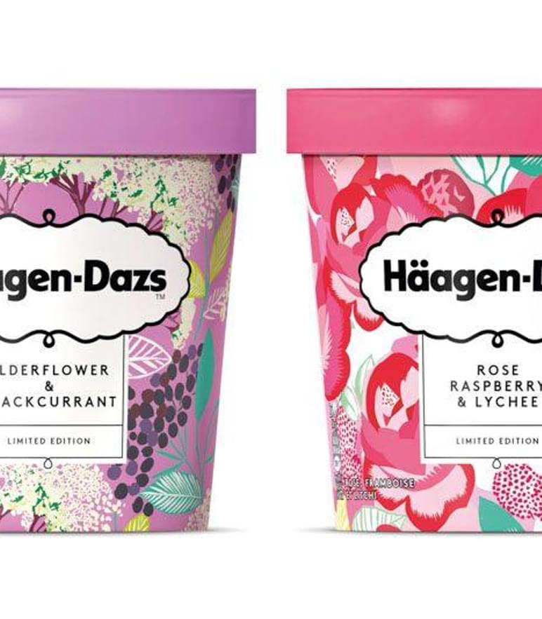
Brand’s often look to research to select from an array of possible design routes. Decisions often depend on a combination of metrics: from liking, stand out and a design’s ability to land intended equities.
This state of affairs has served brands reasonably well, but with Millennials more predisposed to ‘discovery brands’ that disrupt category norms, offering ways to express identities across social media, I believe that our aspirations for pack development must also shift. ‘Liking’ is no longer a reliable predictor of success. The shift is towards meaning.
And with consumers less available to advertising, packs must become better at representing what the brand actually stands for - relying less on the written word. Key equities now need to land without the shopper even being aware that communication has taken place!
Fact is, we all rely heavily on non-conscious cues when it comes to making judgements.
Studies measuring the relative power of verbal and nonverbal communications in social and business situations conclude that human body language is by far and away the most powerful element of communication. One study suggests that over 90% of the way we receive and decode meaning from others involves complex mechanisms that go beyond the spoken or written word.
Brands that seek to stand for something quickly and efficiently in an increasingly fragmented world, must embrace the opportunity to engineer brand ‘body language’ to boost communication of key messages.
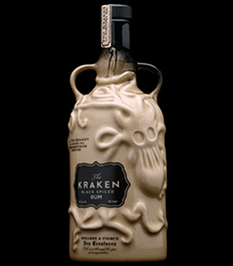
Take The Kraken. A brand that seeks to be cool, adventurous and free-spirited. In a category based audit, we used sensory led techniques to capture the non-conscious decode of the brand's very distinctive bottle. This revealed how its structure works efficiently to reinforce its treasured equities. The Kraken earns superior authenticity and premium credentials by going way beyond the graphic. Its bottle looks like it’s been rescued from a shipwreck!
A sensory led approach informs on what attributes – beyond the graphic - will create the most powerful representation of the desired brand identity. It’s the amalgam of graphic, structure, texture, weight and even sound - working seamlessly together to boost non-conscious communication.
By thinking about your brand’s body language, I’m confident that you can promote a more compelling pack strategy that works harder at the intuitive level.
A further benefit of a sensory led approach, is the opportunity to create a more holistic brand experience.
One exciting and illuminating example of this is very real way a pack can influence the perceived reality of the consumer’s subsequent product experience.
In an experiment, we placed five structurally different orange juice packs into a consumer test. Each pack was completely de-branded so that we could measure the impact of structure alone.
Consumers were asked to pour some orange juice from each of the different structures and rate the liquid across a range of typical measures. What they didn’t know was that the orange juice was exactly the same in all cases.
The results underline the power of priming: square structures increased perceived intensity of taste. Clear structures increased perceived viscosity (thickness). And so on…
Could structure improve the perceived reality of your product experience? There's most likely some headroom for improvement.

I hope I’ve shown how much here is to gain from going beyond the graphic in pack development and testing. This is not to underestimate the power of graphics to communicate key brand and product messages. However, more energy in the direction of a brand’s sensory construction will allow packs to compete better at the intuitive level and even improve the performance of the consumption experience that follows.
Insights

24 Mar, 2026
Designing Better Products With Less Data: How and Why We Created Sensory AI Drivers+
Read MoreInsights

18 Mar, 2026
Some brands talk about being consumer‑centric. Others live it.
Read MoreInsights
12 Mar, 2026
Five Products: Climate-Proofing Beauty & Helping Consumers Prepare for a Hotter, Harsher World
Read MoreIf you'd like to understand a bit more about us or find out how we can help solve your challenges, check out our team's availability and book in a call at a time that suits you.
If you'd prefer to chat over email, fill out your details below and we'll get back to you as soon as we can.